Helping SMBs Manage
Their Operations

Introduction
In July 2023, I received an offer to join Midaflow as a Product Design Intern. This was my first real opportunity to contribute to a live product alongside a team.
Previously, I had only worked on conceptual projects, so transitioning to a product that users would actually use was both exciting and challenging.
The challenge was that I had no background in financial technology, nor did I have any understanding of ERP systems or how they functioned.
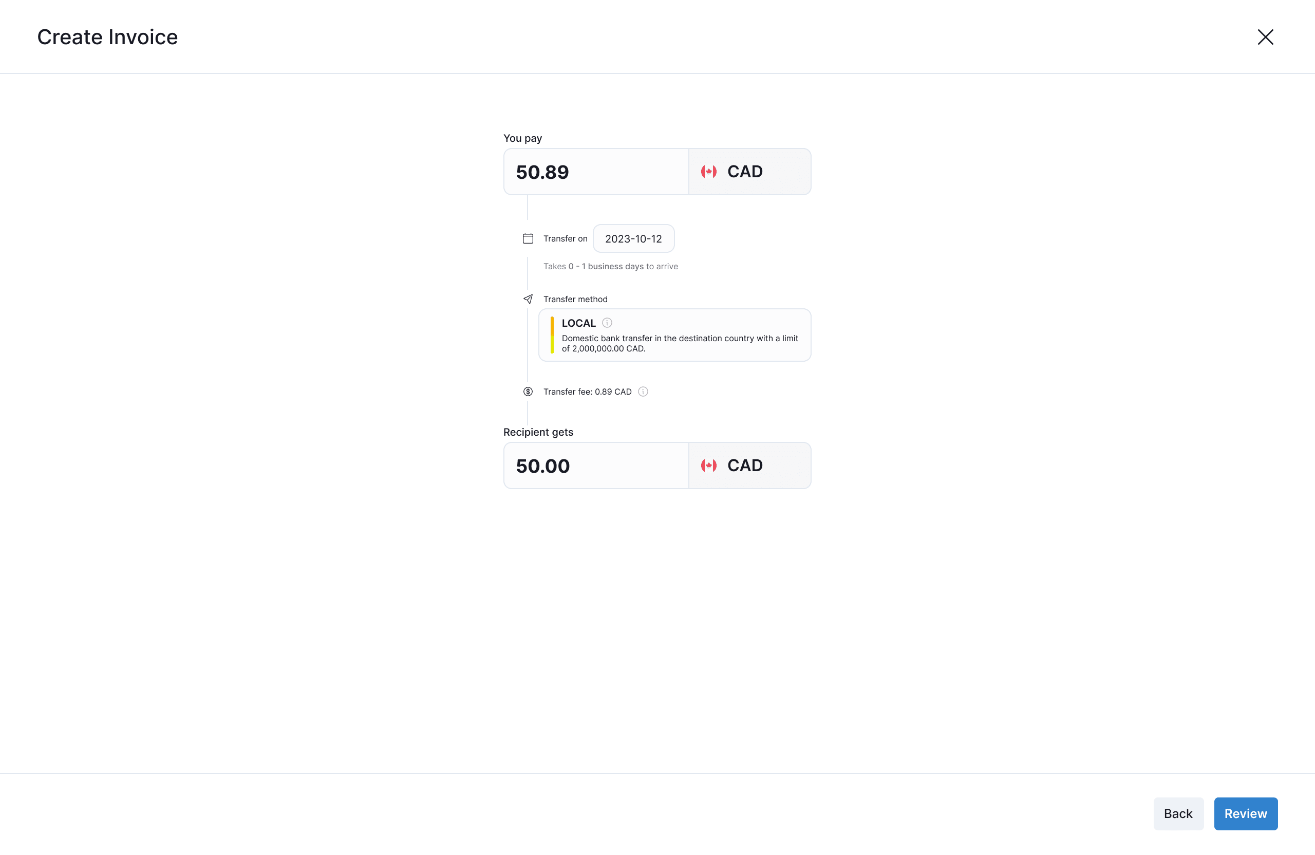
Create Invoice in Midaflow
Context
Enterprise Resource Planning (ERP) systems are software solutions that help businesses manage various aspects of their business in one centralized platform. They integrate functions like accounting, inventory management, purchasing, human resources, marketing, and many more, allowing businesses to streamline their operations and reduce manual work.
Traditionally, ERP systems were custom-built and tailored towards large corporations leaving many small and medium-sized businesses (SMBs) with fragmented tools and inefficient workflows. Managing payments, invoices, and vendors across multiple platforms can lead to errors, delays, and extra costs.
The founders of Midaflow saw a gap in the market, they saw SMBs struggle to find an ERP system that is both easy to use and affordable. To bridge the gap between powerful enterprise software and the usability that growing businesses need, they created Midaflow, an ERP system designed specifically to help SMBs manage their payments, invoices, and vendors more efficiently.
Business Intelligence & Analytics
Manufacturing & Production
Sales & Order Processing
Inventory & Supply Chain
Customer Relationship Management
Finance & Accounting Management
Human Resources & Payroll
Procurement & Vendor Management
Functions of an ERP System
Responsibilities
When I joined Midaflow, they were already in the midst of active development, so my role as a Product Design Intern was to design features, flows, and components based on requirements provided by the Project Lead.
Since the founders had industry experience, research was not a priority. My focus was solely on executing design tasks to support the ongoing development process.
Design
The design process was more straightforward and execution-driven, with a focus on speed in order to reach the deadline for the minimum viable product.
I would receive assignments through Jira, conduct any necessary research, create the designs in Figma, and submit them for review.
Midaflow’s design system was built using Chakra UI, which provided a foundation of pre-defined components. When creating mockups, I tried to work within these confines to ensure consistency between designs.
Tasks Assigned
I received Jira tickets from my Product Lead, each detailing the feature’s requirements through user stories.
Research
I reviewed competitor designs and existing UI patterns to meet the feature’s requirements.
Design
I created high-fidelity mockups in Figma based on the design system.
Submit for Review
I handed off my designs to the Product Lead for validation and feedback.
Vendor Details Layout
In the beginning, the Vendor Details Layout was pretty bare with just the business type and the date of creation. For this task, my Product Lead provided a template of how vendors’ information is stored in our database. I reviewed the template and noted what I thought would be useful for users to include in the layout such as banking details and the vendor’s address, the latter being a requirement from the Product Lead.
Additionally, based on my personal experience working in eCommerce, I added an additional field which was the Point of Contact. In my experience, having a direct contact with the vendor or distributor made managing relationships much easier, so I felt it would be valuable for users.
I also added a button that allows users to quickly add a new invoice. This provides an efficient way for users to take action within the vendor detail page without navigating away.

Before

After
Vendor Transactions Table
The Vendor Page initially only contained the card with the Vendor Details with the remaining of the page being underutilized so I had to create the component for the Vendor Transactions Table from scratch. I structured the table using our invoice-related fields such as status, due date, pay date, purpose, and invoice number, ensuring that users could quickly scan and understand their transaction history at a glance.
To enhance usability, I added action buttons at the end of each transaction row: Cancel for transactions that were still cancelable and View to access the full invoice details. At the top of the table, I included a filter to help users quickly narrow down their transactions, which felt like a logical addition for managing large datasets.
Lastly, as is common in many transaction tables in other applications, I added a Download Transactions button, allowing users to export their transaction history for record-keeping or further analysis.

Transactions Table
User Entity Flow
For the User Entity Flow, since there wasn’t initially a dedicated page or location for that feature, I decided to integrate it into the Settings page which was designed by Stella He, the other Product Design Intern. This placement made the most logical sense within the existing structure.
The design itself was straightforward, but I made the decision to add an additional button for each user to allow quick email/contact access, providing a more convenient way to reach team members.
For editing user information, the Product Lead specified that this should be handled using a slide component. Given this requirement, I kept the design simple and clean, focusing on intuitive usability.

User Entity Settings

Edit User Entity Slide
User Onboarding Flow
For the User Onboarding Flow, I was tasked with designing the modal where an invited user sets up their password after clicking the invitation link. Since the Product Lead specified that this should be handled within a modal, I focused on keeping the design simple and clear.
Beyond the standard input fields, I included the minimum password criteria to ensure users create an acceptable password to avoid any frustration with trial and error. By displaying these requirements upfront, users know exactly what’s expected, reducing the likelihood of errors and making the onboarding process smoother.

User Onboarding Modal
Invoice Approval Flow
For the Invoice Approval Flow, the Product Lead specified that the design should use the slide component. With this in mind, I structured the layout to ensure all critical information was easily accessible and scannable.
I included all the necessary details to fulfill the requirements: payee information, invoice date, due date, invoice items in a table format, and a dedicated section displaying the list of approvers and their approval status.
Even though these were standard elements, the goal was to ensure a clear hierarchy of information so users can review key details at a glance and take action with minimal friction.

Invoice Approval Slide
Dashboard
Initially, the Dashboard page only contained three cards displaying key metrics, with the rest of the page not being utilized.
The first thing I did was create a component to display the number of invoices for each vendor categorized by their stage in the invoice lifecycle. The Product Lead specifically asked for a stacked bar graph to visualize this data, so I implemented it to provide a consolidated view of invoice distribution across the lifecycle stages.
The next component was the pie chart, which was required by the Product Lead to visualize the distribution of invoices that were in the Paid, To-be-Paid, and Overdue stages.
The final component that I added myself displayed invoices that were awaiting payment along with the cumulative amount. I chose this data to display because I believed it would be highly relevant and useful for users. It offered actionable information by highlighting invoices that were pending payments.
Finally, I replaced the Invoices Paid card, as its information was now effectively covered by the pie chart and the invoice overview with a key metric that would be useful.

Before

After
Challenges
Coming into this project, I had no prior experience with ERP systems, so I had to quickly familiarize myself with their workflows and functionalities. I conducted preliminary research on our competitors to understand how they structured their features and user flows. Additionally, I analyzed their user feedback to identify common pain points and ensure my designs avoided similar pitfalls.
I had also lacked experience in desktop design. Having worked primarily on mobile projects, I wasn’t used to designing with so much screen space. This required a shift in my design thinking, which led me to intensely study UI patterns for desktop. I had to explore best practices for layouts and information hierarchy to effectively make use of the available screen space.
There was also the issue of maintaining design consistency. Since there was another designer on the team, and there wasn’t really a comprehensive design system with guidelines and principles, inconsistencies started to emerge especially since we had to design beyond the default Chakra UI components. I brought this up to the Product Lead, highlighting the need for more structured design documentation and alignment to ensure a cohesive experience across the platform.
The presence of too many features can get work done faster but at the same time can get people confused.
Feedback from Software Advice
It is difficult for our vendors to submit quotes and there is no way for them to add options or alternatives.
Feedback from Gartner
I like how it automatically integrates with some vendors to automate the purchase order and invoice matching process.
Feedback from Gartner
The services are overall every easy to use from both an end-user perspective and an admin perspective.
Feedback from Gartner
Specifically, we are struggling with the supplier integration and though we have weekly calls, we are still having problems.
Feedback from Software Advice
Easy implementation, very user friendly, multiple customization options to fit our needs, and great mobile app.
Feedback from Software Advice
Reflection
Working on this project has changed my mindset when it comes to Product Design. Unlike past projects where I had full creative control, this experience required balancing user needs, technical constraints, and business goals. I learned a lot about collaboration, working with developers and other designers, and working within existing frameworks.
I’m grateful for the opportunity to grow both professionally and personally. The challenges I faced have equipped me with valuable insights and knowledge that I applied to future projects.

Dashboard Redesign Concept
© 2025 Brian Mac. All Rights Reserved.